
UX web audit and mobile design for Salt Athletic’s e-commerce website to improve navigation and usability.
UX web audit and mobile design for Salt Athletic’s e-commerce website to improve navigation and usability.
As a sole designer, I was tasked to complete a website audit for saltathletic.com. I leveraged customer analytic data and user research to create, propose, and implement design decisions for an e-commerce website. These recommendations aimed to help the company towards a website redesign.
I prioritized improving mobile web usability and customer experience to drive business results.
Users and customers experienced uncertianty through navigational challenges and limited context, which led to to increased search times and difficulty finding information.
These barriers left users unsure about the appropriate way to seek customer support and the expected response time which often led to frustration. As a result, some users resorted to leaving negative reviews regarding issues such as order status instead of reaching out to customer support.
How Might We...
Improve the way users navigate, find and understand information to increase customer clarity and confidence?
I focused on usability through language and UI to design iterations for 3 key pages that are integral to the customer journey: The home page, product page and contact us.
I came up with a design strategy to assess the usability of the current site, recommend changes, create testing plans and present my findings and next steps to stakeholders.
Increase sales
Use web audit as a basis for website redesign
Increase community engagement
No design system currently established in Figma
Need to create solutions for easy implementation in current structure.
Short project timeline

I decided to approach the website first by viewing it as a designer: What are heuristic evaluation principles that should be implemented, is the contrast suitable for WCAG standards? are there any usability issues we can observe right away? lets take note of all of these findings!

I organized and ranked my findings based on priority for usability and highest potential impact for users and business.
As a solo designer I needed to be realistic about my goals, and look at what I could achieve in the current timeline, So I aimed to focus on the 80/20 rule by focusing on key points from initial observations, data and analytics. These were my goals for the project.
Leverage user behaviors to improve experience
Prioritize Experience on Mobile View
Advocate for Usability & Accessibility
After conducting user research through analyzing current customer reviews and conducting usability tests, I observed the following pain points.
Currently the only way to access frequently asked questions is through a single button on the product page or through a navigation link on the footer.
When arriving on the contact page, there was no instructions or context given which made it difficult for customers to understand if they were in the right place to access support. This led to users feeling confused, frustrated and unsure of how long it would take for support to get back to them.
The current footer has an extensive amount of options that leads to cognitive overload, and increases the amount of time users take to complete tasks.
In order to address concerns that would make the greatest impact, I broke down the target audience into user stories to address their problems and work towards opportunities. For this project, I focused mainly on this scenario.
User Story:
I am a customer who needs support for an order I have not received- but I don’t know the best way to contact customer support, Which makes me feel unsure and frustrated.
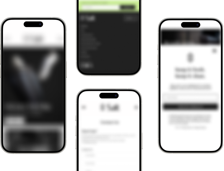
I focused mainly on designing for these 3 full mobile pages that are integral to the customer journey. The home page, product page and contact us.


These are images of the current screens! My redesigns and iterations are not available to the public yet
Because this project was focused on mobile view wireframes, we need to ensure design consistency and effectivity through the other device breakpoints. (desktop and tablet)
Creating a design system will not only help to keep cohesion, consistency and usability, but it will also make development and implementation much faster!
It will be exciting to observe the impacts of our changes when the client facing updates will be shipped; In order improve designs based on user behavior, we can use further testing methods to find what makes a bigger impact.

If you are a recruiter and would like to learn more about my project, send me an email! ✉️